Together with some friends I participated in this year’s NASA Space Apps hackathon. We saved a spot at the Gothenburg local event and spent 3 awesome days working together on our challenge aswell as enjoying the program including an unforgettable evening event at Universeum.

Tl;dr: We developed an application that combines text data processing techniques and generative AI to translate unstructured complex texts into engaging and easy-to-understand visualizations such as flowcharts and videos.
NASA Project Page: https://www.spaceappschallenge.org/nasa-space-apps-2024/find-a-team/mus-musculus/?tab=project
Demo: https://tourmaline-kitten-220a0b.netlify.app/
GitHub: https://github.com/TomiZ87/nasa_space_apps_2024/tree/main

The Contribution of our team Mus Musculus for this year’s NASA Space Apps hackathon (2024) got us nominated as global nominee. But what happened before…
- The Challenge
On Friday evening before the official start of the hackathon, we met and discussed the 21 challenges created by NASA for the hackathon. We finally decided on “Visualize Space Science”. This advanced challenge required knowledge in areas such as data science, GenAI, GUI or web programming, so that each of us could find our interests in it.


- The Local Event
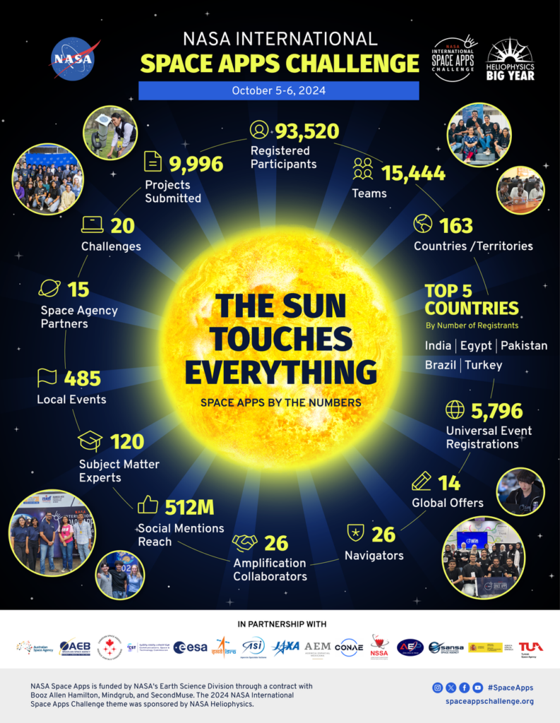
Although it is very impressive that NASA Space Apps is an international hackathon with almost 100,000 participants, in which you can only participate online, the real hackathon feeling for me is when I sit in a hackspace with my group and completely immerse myself in the hacking world for a weekend.
Fortunately, the Gothenburg team organized a fantastic local event. My particular highlights were the many talks by speakers from academia and fields such as venture capital and entrepreneurship. On the evening of the first day, we were invited to an event at a technology and natural history museum (Universum). Surrounded by huge aquariums, we were able to chat with the other participants over good food and plenty of drinks. Afterwards we went to the museum’s Dome Cinema and saw the most amazing journey through our Universeum that I have ever seen. - First Steps
Initially, we started by throwing entire complex text files at AI ChatBots and asking them to generate explanatory images or even flow charts. We quickly realized that we would not be successful this way. Even with very detailed prompts, the GenAI models would generate highly distorted and unhelpful images.
So we went into the next iteration and thought about how we could structure the information from the NASA text documents without the help of AI and have more control over the actual generation of visualizations. It makes much more sense to develop your own framework and only let AI generate individual small building blocks. This way, you retain control over information processing and can guarantee a consistent structure and design.
In any case, we wanted to offer an appealing summary of the information supported by pictures. The format of a scientific poster seemed the most suitable for this. We created a template with HTML and CSS and used various APIs from OpenAI (especially GPT-4 and Dall-E) to generate content for the poster.

- Presentation and Submission
After achieving first results we were hyped, but still not totally pleased with the visualization (generated images). That’s why we continued researching ways to use GenAI to generate structured and scientific visuals. Julia had the great idea to try feeding our processed information from the txt file to a GenAI model that generates videos including voiceover. That. was. awesome!!
While the images in the generated video still were really artificial and less scientific it suddenly wasn’t a problem anymore, because the combination of images, scientific voiceover and editing of the video was suddenly enormously effective in helping to quickly understand the often very complex experiments. Videos as a medium stimulate several senses at once, which makes it easier for us to understand the content and connect it with emotions.
Have a look at the video for OSD-379: Google Drive Link.
Another approach I would love to follow another time is generating code for programming languages which are specifically created to visually structure complex data in charts. I read a very interesting and comprehensive paper on this.
On the last day, we divided our team into two groups so that one half could work on the presentation and the other half could further develop the product and the demo. We attended the presentations of all the other teams at our local event. After the closing remarks we only had 2 hours left until the submission deadline at midnight.
We still had to design our project page and present our project in a video. We were all super tired. The last few hours were correspondingly exhausting. But it was totally worth it! We had so much fun and learned a lot.
If you find the topic interesting or have exciting ideas, please feel free to drop me a line 🙂

